|
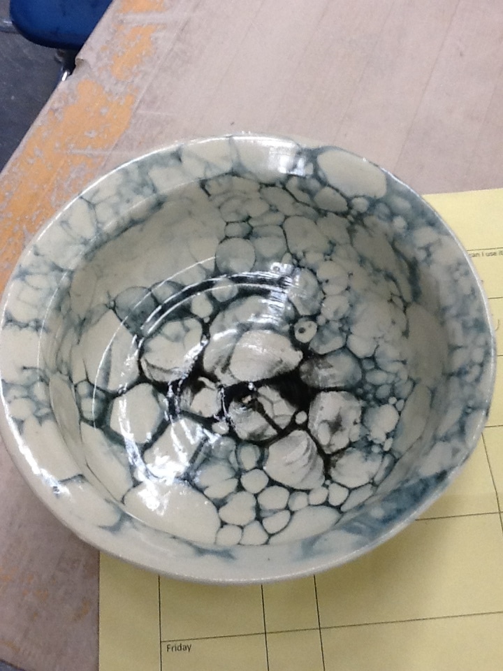
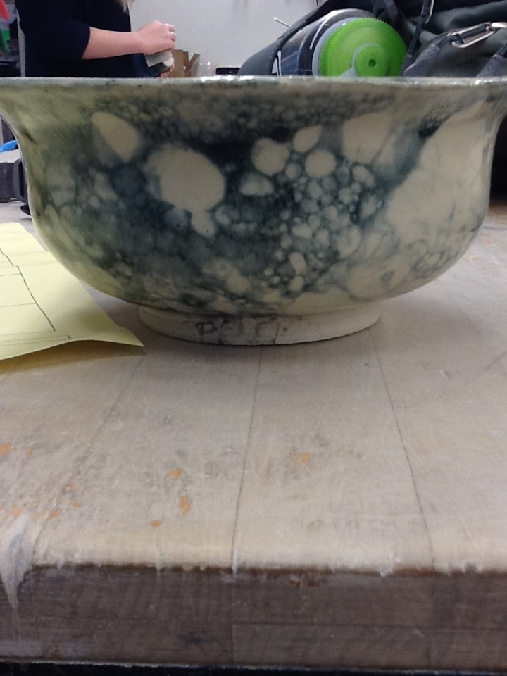
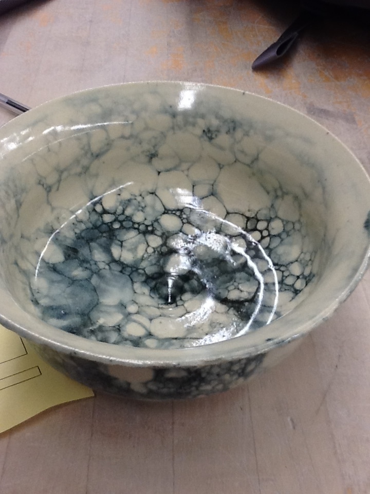
This is my choice set of two. How they are a set is because of their shape and how I glazed them. I glazed them in clear with black bubble glaze on both of them creating the bubble looking glaze. The art elements I used for this was space because of the spacing between the glazing. The principles of design I used were contrast with the glaze and how it really brings out the white bowl.
0 Comments
This is my groups franken pot. My group is very skilled and we put this together like nothing. We glazed it with black and white. This helped us work on our team bonding skills.
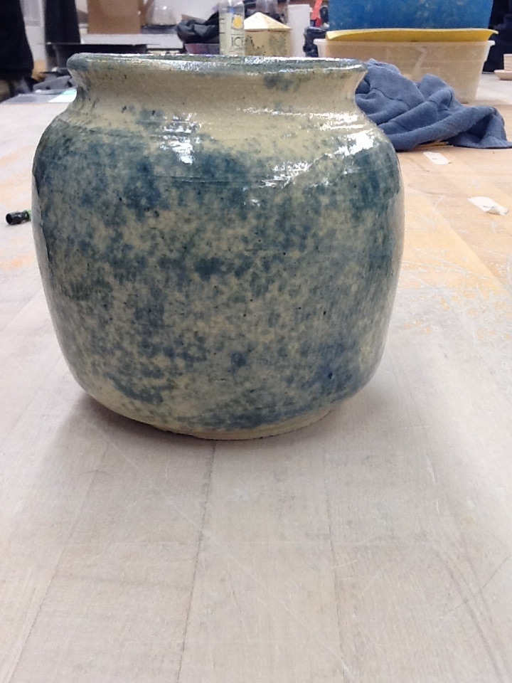
This is my planter. I glazed it with Sydney blue, dark cobalt, and white on top of a clear glaze. I used a sponge to glaze this project in a few spots to give it some cool looking texture. The new skill I learned was pulling two walls for one project. The art element I used was shape because it is a planter and needs to be a specific shape. The principles of design I used was contrast with the glazes to make things pop out.
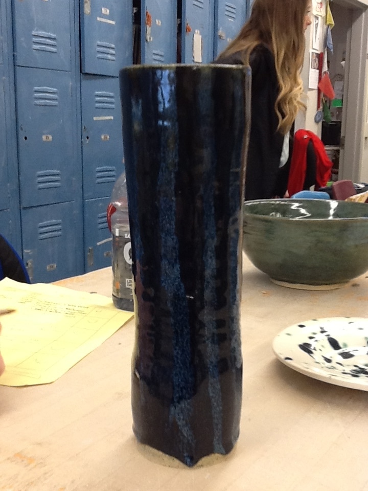
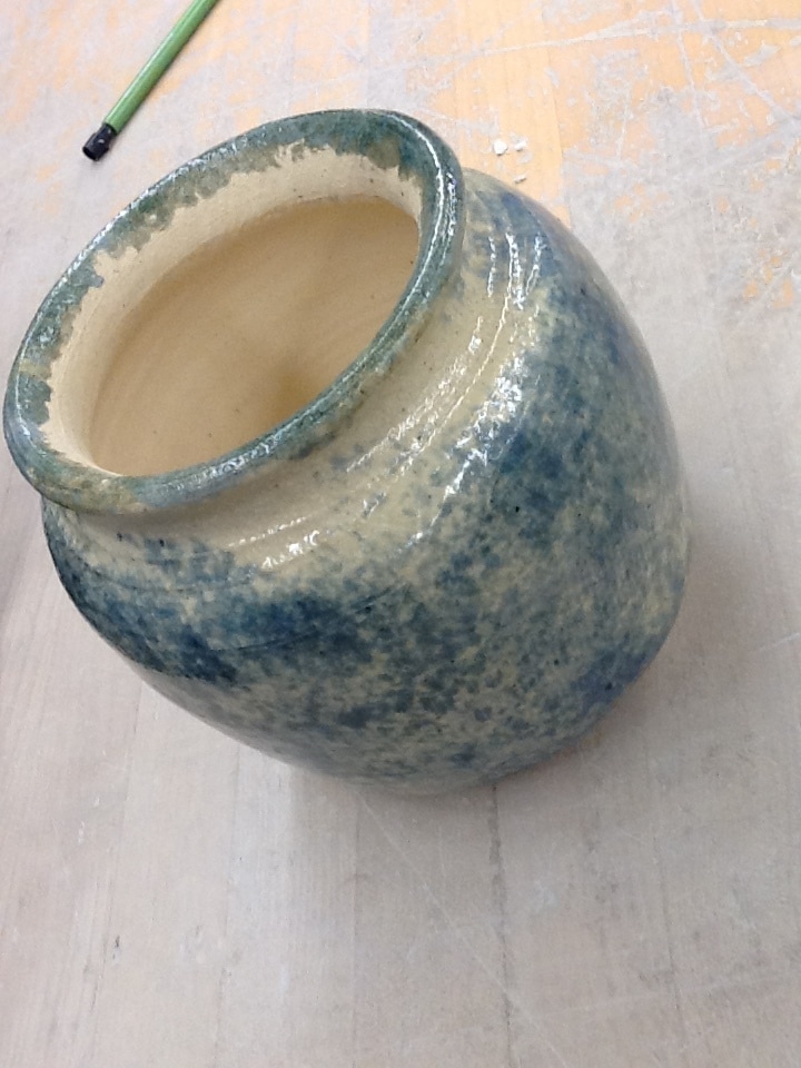
This is my tall vase. How I glazed this was dipping a sponge in the glazes and pressing it up against the vase to create a cool looking glaze and to give it somewhat of a texture. The new skill I learned with this project was glazing because it is a different style of glazing that I used. The art element I used on this project was texture with the glaze to give it a rough feel. The principles of design I used was harmony to show how the whole project went well together.
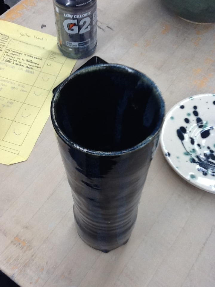
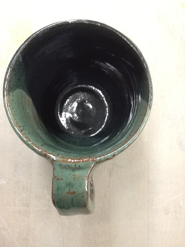
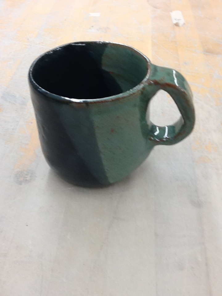
This is my pulled handle project. The glazes I used were forest green and dark cobalt over a red and yellow clay. This project helped me learn and improve on my skills when I pulled my handle. The art element I used in this project was form because of the 3D figure of my mug. The principles of design I used was contrast because I used two glazes that wouldn't go together to make them both pop.
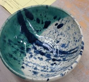 This is my extra project. I made a bowl and used the glazes clear and shadow green. I then splatter glazed Forrest cobalt, dark blue, black, and white glazes on it to make it look like it has a lot of busy things going on in it. The skill I learned with this project was glazing because it was the first time i splatter glazed a project. The art elements I used was color with the glazes that I used to define the shape of the bowl. The principles of design I used was contrast with the light and dark glazes I used on the bowl.
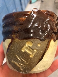
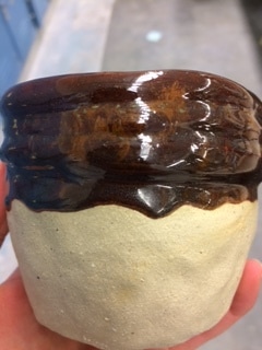
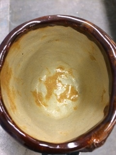
This is our group coil. We made it for coach Brown to hold his whistle. The glaze we used was metallic brown and covered the coils. The skill I learned during this project was slipping and scoring the coils so they would stick together. The art element we used was value with the dark colored glaze with the light colored clay. The principles of design we used was emphasis to make sure to have the color show the textures.
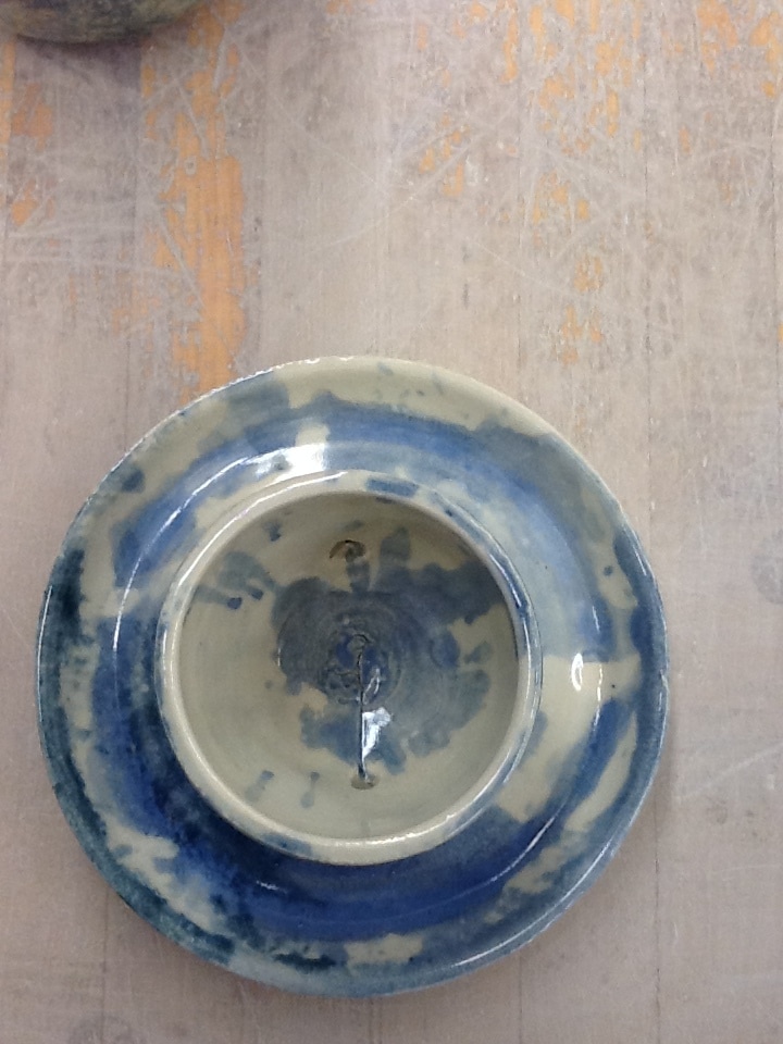
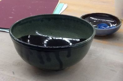 This is bowl number one. It is about 3 inches tall and 8 inches wide. I glazed it with Forest Cobalt with black on the inside and black drip on the outside. I learned the new skill mixing glazes. The design element I used was value because of the light and dark colors. The meaning of this project is to show the mix of darkness in the world.
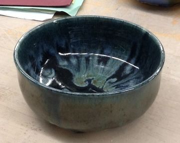 This is bowl number 2. It is 2 inches tall and 4 inches wide. How I glazed it was dark blue with a forest green drip on the inside and a dark blue and forest green mix on the outside. A new skill i learned was blending glazes again. The art element I used was value with the colors. The design element is emphasis. This projects meaning is to sow how I can mix glazes.
|
AuthorWrite something about yourself. No need to be fancy, just an overview. Archives
May 2017
Categories |

 RSS Feed
